Test3: Difference between revisions
From Now That's What I Call Music Wiki
No edit summary |
No edit summary |
||
| Line 1: | Line 1: | ||
< | <html> | ||
<div class=" | <div class="row mb-2"> | ||
<div class=" | <div class="col-md-6"> | ||
< | <div class="row no-gutters border rounded overflow-hidden flex-md-row mb-4 shadow-sm h-md-250 position-relative"> | ||
< | <div class="col p-4 d-flex flex-column position-static"> | ||
<p | <strong class="d-inline-block mb-2 text-primary">World</strong> | ||
<h3 class="mb-0">Featured post</h3> | |||
<div class="mb-1 text-muted">Nov 12</div> | |||
<p class="card-text mb-auto">This is a wider card with supporting text below as a natural lead-in to additional content.</p> | |||
<a href="#" class="stretched-link">Continue reading</a> | |||
</div> | </div> | ||
<div class="col-auto d-none d-lg-block"></html> | |||
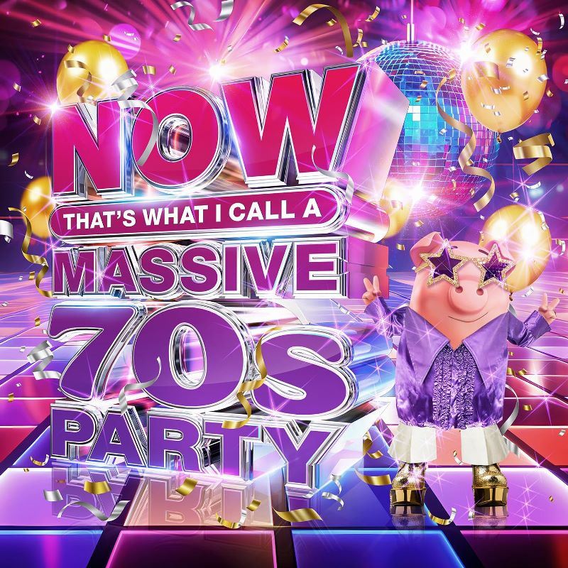
[[File:Now massive 70s party.jpg]]<html> | |||
</div> | </div> | ||
</div> | </div> | ||
</div> | </div> | ||
<div class="col-md-6"> | |||
<div class="row no-gutters border rounded overflow-hidden flex-md-row mb-4 shadow-sm h-md-250 position-relative"> | |||
<div class="col p-4 d-flex flex-column position-static"> | |||
<strong class="d-inline-block mb-2 text-success">Design</strong> | |||
<h3 class="mb-0">Post title</h3> | |||
<div class="mb-1 text-muted">Nov 11</div> | |||
<p class="mb-auto">This is a wider card with supporting text below as a natural lead-in to additional content.</p> | |||
<a href="#" class="stretched-link">Continue reading</a> | |||
</div> | </div> | ||
<div class="col-auto d-none d-lg-block"> | |||
<svg class="bd-placeholder-img" width="200" height="250" xmlns="http://www.w3.org/2000/svg" role="img" aria-label="Placeholder: Thumbnail" preserveAspectRatio="xMidYMid slice" focusable="false"><title>Placeholder</title><rect width="100%" height="100%" fill="#55595c"/><text x="50%" y="50%" fill="#eceeef" dy=".3em">Thumbnail</text></svg> | |||
</div> | </div> | ||
</div> | </div> | ||
</div> | </div> | ||
</div> | </div> | ||
</div> | </div> | ||
</html> | |||
Revision as of 14:21, 6 November 2024
World
Featured post
Nov 12
This is a wider card with supporting text below as a natural lead-in to additional content.
Continue reading
Design
Post title
Nov 11
This is a wider card with supporting text below as a natural lead-in to additional content.
Continue reading